Alarms Management
During one of my past job experiences, I had the opportunity to architect the redesign of an alarms management page for broadband devices. The purpose of this page was for users to view current or past connection statuses of any broadband device that sent out a warning or critical code on their network. The way the page originally worked was that all alarms, active or resolved, would be dumped into a large data table that required much sifting through before getting to the crucial information. The redesign aimed at streamlining the data searching process, increasing the amount of data that could be parsed, improving data organization, and moving the priority of active device statuses to be front and center.
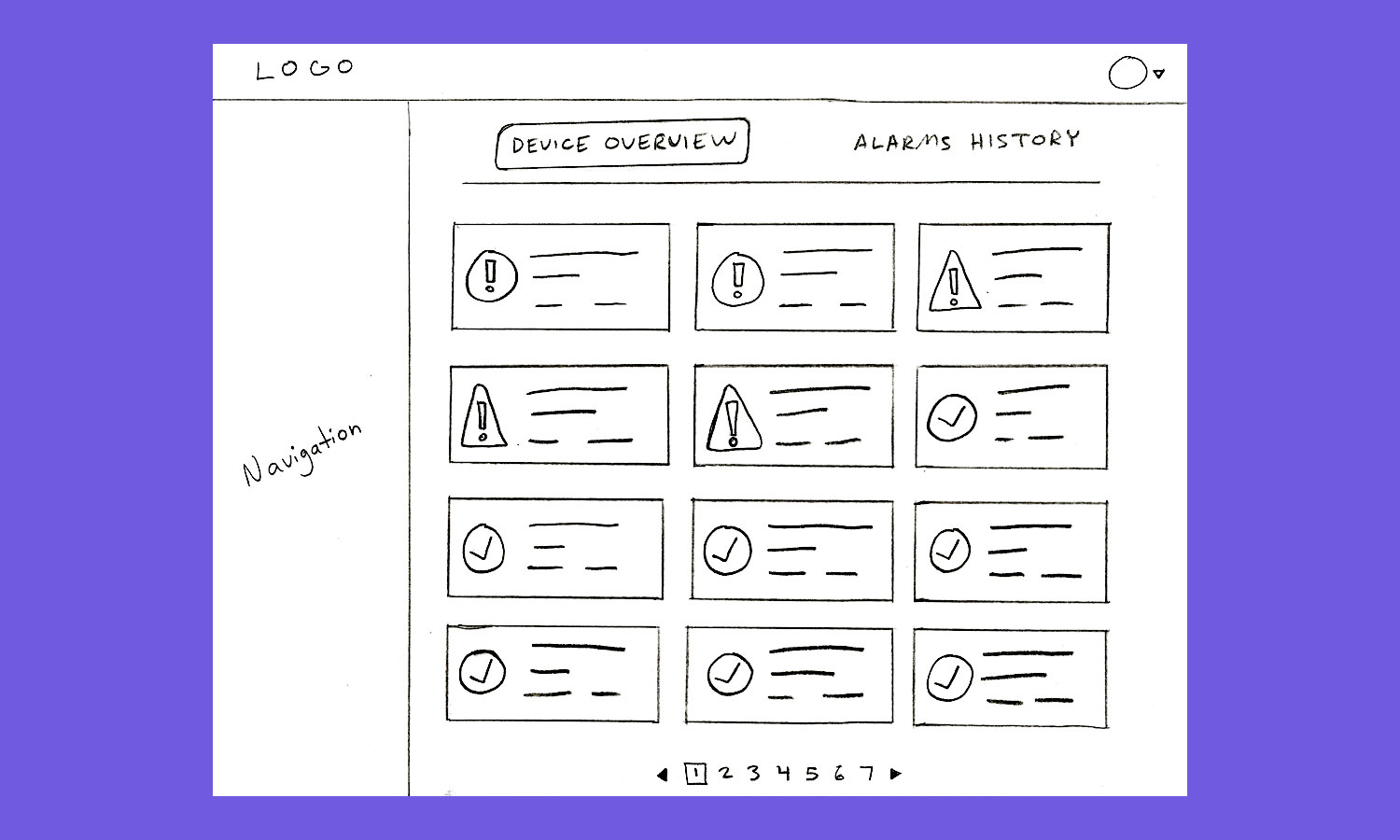
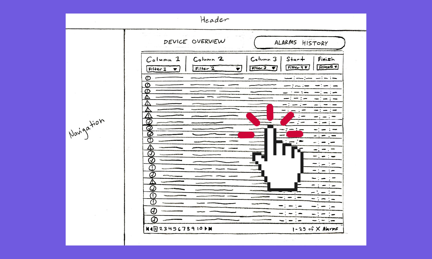
In order to achieve these goals, there were a few new features that needed to be adopted. First was splitting the alarms page into two separate tabs - the first being the device overview tab and the second being the alarms history tab. The overview tab would show all devices along with their statuses in a grid format. All warning and critical devices were sorted to the top of the grid. This is the tab that users would see first so that any active devices were at the front of their attention. The alarms history tab, on the other hand, would be a library for storing all codes, past or present, in order to investigate the reason for why a device went into severity state. Related alarm entries within the history table could be accessed directly by clicking on the device in question on the overview tab, or the data could be filtered by users manually if a more advanced search was required. The history tab’s table was based on the original alarms table, but with a few major overhauls and key improvements. First was improving the filters. The original alarm page’s filtering capabilities were barebones, so filtering and sorting options were increased to make the process more robust. The next improvement was adding prominence to active alarms. These active severe-state entries would filter to the top, with background colors matching their severity indicator icons to draw attention to their active status. The largest change, though, had to do with the data within the row itself.
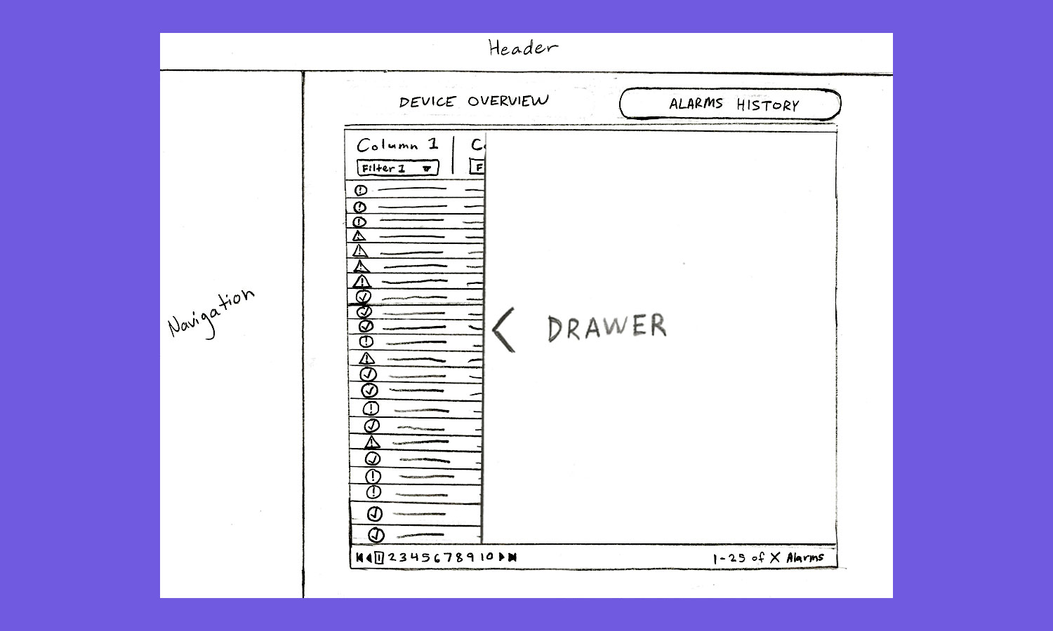
The data in the alarms table was not efficient for solving device failures. There was way too much of it, making it time-consuming and frustrating for users to have to filter and sift through unrelated data to find what they were looking for. So, we created new alarm data structures to better organize and compartmentalize how alarm events should be read. Before, every time a device would ping a status code out, that was considered an alarm event. The problem with that method was that a device could send out 10 to 20 pings within a 30 minute span that were all based on the same initial cause. So, we grouped these together and defined this grouping as the new alarm event. This cut the table entries down to a fraction of their original size. Filtering and scrolling for information was easier, and data loaded much faster. All information contained in the new event was then able to be retrieved and viewed inside of a fly-out drawer that appeared upon click of the event’s table row. Once the drawer slid into view over the first table, the user could then view a new table containing each unique alarm code ping and all of its related details. Being able to scroll through event groupings before reading through the actual codes allowed users to identify faster where they needed to investigate and gradually dig deeper into the root cause of their device failure.
With all of these improvements, the alarms management page was transformed from a basic data table into an entirely new, straightforward and efficient lookup process.

